


How To Make Shopify Product Pages More Convincing

A product page has one job: take a visitor who's interested in a product and give them enough confidence to buy it. Most Shopify product pages don't do this well. They describe the product accurately, load quickly, and display real prices — and still lose 70% of visitors before checkout.
The gap between "technically fine" and "actually convincing" is where most eCommerce conversion is won or lost. According to Senja's research, 73% of visitors bounce without buying even when they're clearly engaged — reading descriptions, viewing multiple images, spending time on the page. They're interested. The page just isn't closing the deal. Shopify gives merchants the tools to fix this — the question is knowing what to fix and in what order.

Start With What's Blocking the Decision
Before adding elements to a product page, identify what's stopping the purchase. The most common blockers aren't what merchants expect. They're not price — they're unresolved questions. Shoppers who bounce without buying are almost always holding an unanswered question: Will this fit? Will it work with what I already have? What happens if it's wrong? How long will it take?
A practical audit before making any changes:
- Read your own product page as a first-time visitor. Write down every question you have after reading the description. Those questions are the gaps in your copy.
- Check your customer support inbox. The questions your support team gets most often are the ones your product page isn't answering. Every recurring support question is a missing product page element.
- Review your return reasons. Products returned because they "weren't as expected" or "didn't fit" indicate that the page oversold or underspecified. Adding accuracy to the description reduces returns and increases the trust of future buyers simultaneously.
Once you know what questions the page is leaving open, the following elements become tools for answering them — not decorations to add for their own sake.

Reviews: The Most Underoptimized Element on Most Product Pages
According to Eklipse Creative's analysis, 65.9% of shoppers rely on reviews before purchasing. Product pages featuring reviews have 3.5x higher conversion rates than pages without them (Rebuy Engine, citing industry data). Despite this, most Shopify stores display reviews poorly — buried below the fold, unformatted, or missing entirely on newer products.

What makes a review section convincing versus merely present:
- Quantity signals authenticity. A product with a 4.4-star average across 300 reviews converts better than one with a 5.0 from 12 reviews. The perfect rating with few reviews reads as suspicious. Show the total review count prominently alongside the star rating.
- Recency matters. Reviews from three years ago don't reassure a 2025 buyer. Prioritize displaying the most recent reviews first, and actively collect new ones with automated post-purchase email sequences.
- Don't hide negative reviews. According to ConvertCart's research, customers actually want to read about potential drawbacks. A brand that censors negative reviews loses trust faster than one that responds to them publicly. A 4.6 with visible critical feedback outconverts a 5.0 that looks curated.
- User-generated content in reviews converts. Reviewers who include photos or videos of the product in real use provide the closest substitute for physically examining the product. Enabling image uploads in your review app and filtering for UGC reviews to display first significantly increases their persuasive impact.
- Place reviews near the buy decision. Reviews below the fold are read by shoppers who are already interested. Reviews visible in the buying zone — near the price and Add To Cart button — catch hesitant shoppers at the moment of decision.
Trust Signals That Resolve Purchase Anxiety
Trust signals are elements that answer the implicit question every first-time buyer is holding: "Is it safe to buy from this store?" For established brands with strong recognition, this question is already answered. For most Shopify merchants, especially those selling to new customers, it needs to be answered on the page.
The trust signals that directly affect product page conversion:
| Trust Signal | Where to Place It | Why It Works |
|---|---|---|
| Returns policy (plain language) | Near the Add To Cart button | Removes the "what if it's wrong" blocker at the decision point |
| Star rating + review count | Directly below product title | First visible social proof before the shopper reads anything |
| Secure payment badges | Below Add To Cart, above fold on mobile | Addresses payment security anxiety — 18% of shoppers don't trust eCommerce brands with card data (ConvertCart) |
| Shipping timeline | Near Add To Cart | 22% of shoppers abandon due to unclear delivery timelines — specificity converts ("Arrives by Thursday" vs "3–5 business days") |
| Press logos or certifications | Below the buy zone or product description | Transfers third-party credibility to your brand — particularly effective for new or unknown products |
| Source: Rework Resources trust signal research; Clickpost abandonment data 2025; ConvertCart social proof analysis | ||
Placement is as important as presence. According to Rework Resources' eCommerce trust signal research, security badges should appear on product pages to establish early trust, on cart pages to reinforce it as intent increases, and on checkout pages to address maximum purchase anxiety. A trust badge buried in the footer resolves no one's doubt.
Product Imagery that Resolves Doubt
Online shoppers can't touch your product. Imagery is the primary substitute for physical examination — and most product pages underinvest in it. Professional photography from multiple angles is the baseline. What actually moves conversion is imagery that answers the questions a physical inspection would answer.
The types of imagery that convert versus the types that merely display:
- Scale imagery: showing a product next to a recognizable object (a hand, a common household item) resolves the size ambiguity that studio photography creates. A bag photographed alone is impossible to size. The same bag held by a person is immediately contextual.
- In-use imagery: showing the product being used — not posed with it — demonstrates function in a way that product shots don't. A blender photographed alone tells you how it looks. A blender being used in a kitchen tells you how it works and what the experience of owning it is like.
- Detail close-ups: stitching, material texture, hardware quality, port placement — whatever a discerning buyer would look at in a physical store deserves a dedicated shot. High-consideration buyers will look for these images before committing.
- UGC and customer photos: images from real buyers in real environments convert differently than professional product photography because they're trusted differently. Visitors who see products in customer-submitted photos understand that the product looked that way without studio optimization — which is exactly what they're trying to evaluate.
Copy that Closes
Product descriptions that list features don't sell. Descriptions that translate features into specific outcomes for specific buyers do. The gap between these two approaches is the gap between a page that informs and a page that converts.
A framework for rewriting any product description to be more convincing:
- Open with the outcome, not the product. "For runners who need reliable grip on technical terrain" is more convincing than "All-terrain trail shoe with aggressive outsole." The first identifies a buyer and their need. The second describes a product attribute.
- Translate every feature into a customer benefit. For each spec listed, ask "so what does this mean for the buyer?" and write that answer instead. "600-fill-power down" becomes "stays warm at temperatures below 15°F without adding bulk under a jacket."
- Address the most common objection directly. If customers frequently ask about durability, address durability explicitly in the description. If size is the common concern, add a sizing section with specific measurements. Objections addressed on the page don't become reasons to leave.
- Use the buyer's language. Read your own reviews to find the exact phrases customers use to describe the product's value. Those phrases — not marketing copy — are what future buyers are searching for and responding to.
The Area Around Add To Cart
The Add To Cart button zone is the most valuable real estate on the product page. Everything a hesitant buyer needs to commit should be within sight of that button without scrolling. Most Shopify stores don't optimize this area — they put the price and button there and leave everything else to chance.
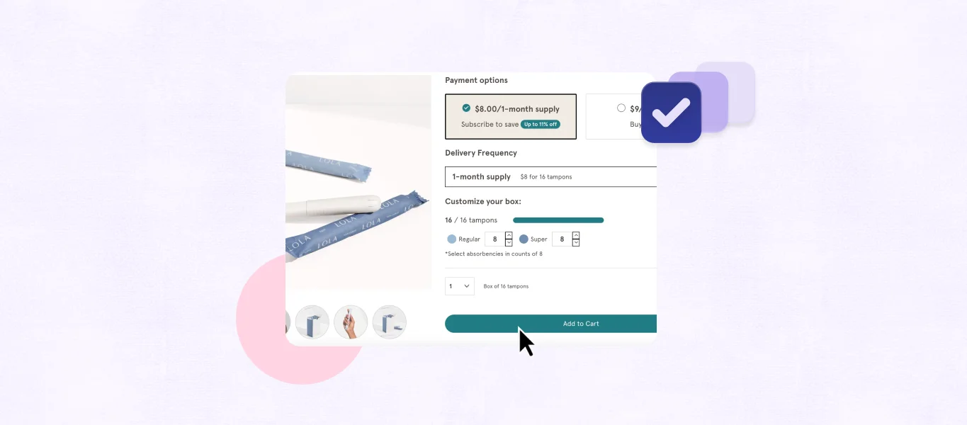
A high-converting Add To Cart zone typically includes:
- Price (clearly displayed, with any sale pricing showing original vs. discounted)
- Variant selectors that are clearly labeled and visually distinct when selected
- Stock urgency if genuine ("Only 4 left" — only when true; false urgency erodes trust)
- Returns policy in one line ("Free returns within 30 days")
- Shipping estimate ("Free shipping on orders over $50" or "Arrives by [date]")
- Payment options icons (Visa, Mastercard, Shop Pay, PayPal, Apple Pay)
- A secondary trust statement if the product is high-consideration ("30-day money-back guarantee" or "2-year warranty included")
None of these elements need to be large. A well-designed product page includes them compactly — visible without crowding the button itself. The goal is that a shopper who reads the price and reaches for Add To Cart sees every remaining doubt resolved before their finger lands.
Final Thoughts
Convincing product pages don't convert through persuasion — they convert through resolution. Every element on a high-converting product page exists to answer a question the shopper is holding, remove a doubt that would otherwise cause them to leave, or provide a signal that the store is safe and the product is what it claims to be.
The stores that consistently convert above their traffic quality aren't spending more on ads or running more promotions. They're running pages where the most common reasons to hesitate have been addressed one by one — reviews that are visible and credible, copy that translates features into outcomes, trust signals placed where shoppers need them most, and an Add To Cart zone that makes the final commitment feel risk-free.
Building product pages that consistently convert on Shopify is an iterative process — but it starts with treating every bounce as a question that wasn't answered, and every conversion as proof that the page finally answered it.
FAQ
How many images should a product page have?
Enough to answer any visual question a buyer would have. For simple products, five to eight images covering multiple angles, scale, and one in-use shot is usually sufficient. For complex or high-consideration products, more is better — detail shots, comparison imagery, and packaging photos all reduce doubt for buyers making careful decisions.
Do product videos actually improve conversion?
Yes, particularly for products where function or fit is difficult to convey through photography. Short-form video (15–45 seconds) showing the product in real use consistently outperforms static imagery for categories like apparel, kitchen tools, fitness equipment, and anything with a notable texture or mechanism.
Should I show negative reviews on my product page?
Yes. Research consistently shows that 100% positive ratings appear suspicious to experienced online shoppers. A mix of reviews including critical feedback — particularly when the brand responds publicly to concerns — builds more trust than a curated positive-only display. Brands that hide negative reviews signal that they don't stand behind the honest feedback of their customers.
What's the most impactful change I can make to a product page today?
Add your returns policy as a single visible line near the Add To Cart button if it isn't there already. It's the most common missing trust signal on Shopify product pages, requires no design change to implement, and directly addresses the "what if it's wrong?" objection that causes a measurable share of pre-cart abandonment.